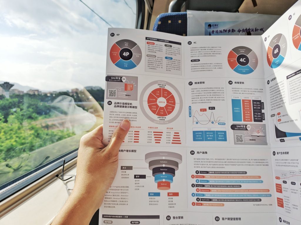
There are few, if any, marketing plans that can succeed without high-quality graphic design in the modern world. From the color of a flyer advertising your services to the fonts and imagery on a coupon, design elements guide your marketing efforts from the first step to the last. The graphic design process that goes into a brochure, in particular, is essential—it’s all too easy for an inferior brochure to end up in the trash.
Use the right tool.

The first step in high-quality brochure design is ensuring you have the best program for the job. If a tool is freely available for anyone to use, it won’t offer the same results as a dedicated graphic design program. Before investing in a paid program, though, you’ll want to make sure it really is a good fit.
Free trials can be a great way to test a design tool, ensure it offers the features you need, and be sure you’ll produce good results. With the right program behind you, you can create the type of brochure that will be irresistible to your ideal customer.
Stay true to your brand identity.

Investopedia defines brand identity as “the visible elements of a brand.” These are the colors, imagery, and other aspects of your design that let your target audience recognize your work in an instant. With that in mind, you wouldn’t want to create a brochure in bright colors if your brand is known for its minimalist, black-and-white design.
Be thoughtful about your visuals.
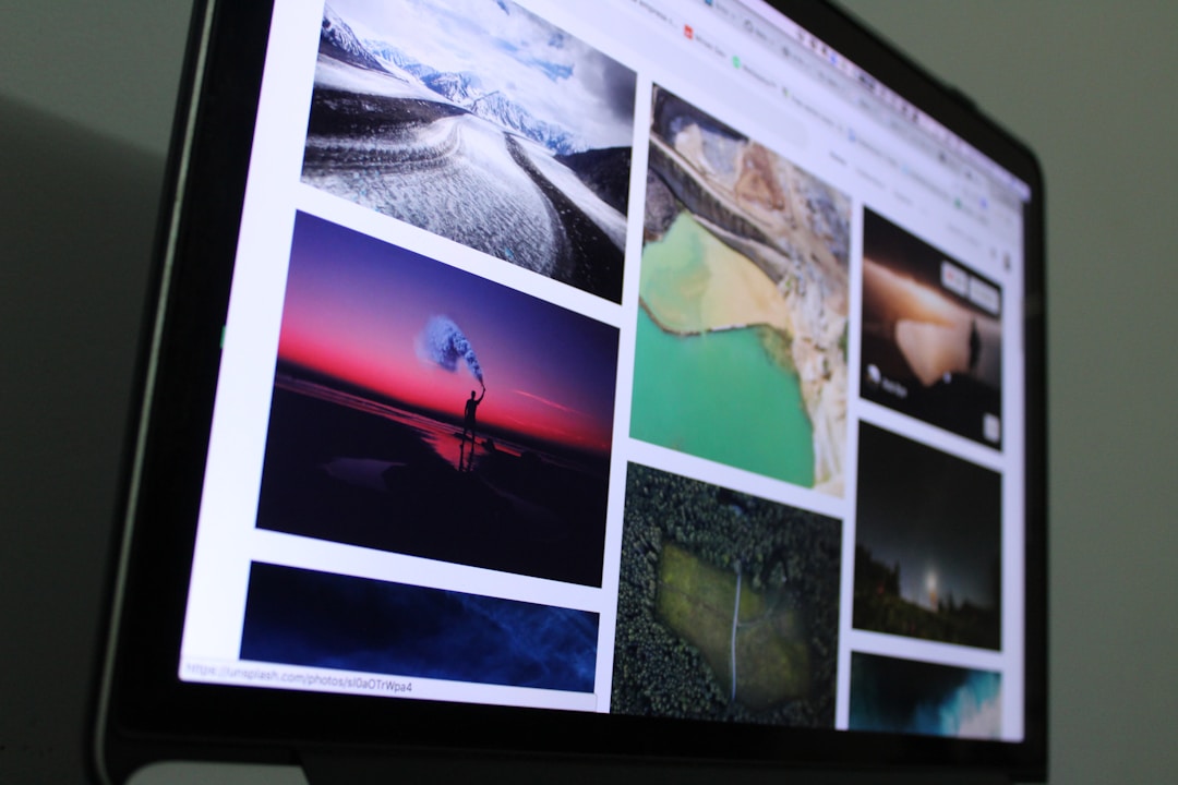
Similarly to keeping your brand identity front and center, thinking through each element of your graphic design plan is essential. From color psychology to the feelings a particular font may elicit, each part of your brochure needs to be considered independently and as a whole. Invest in paid stock photos, so your brochure isn’t identical to another company’s brochure.
Take your brochure template of choice and customize it to create a unique brochure. Every element counts, so make sure you’re letting your brochure showcase your company at every step in the design process.
Consider the context.

This point is two-fold—you need to keep the goals of this brochure in mind as you create it, but you also need to think of how and where it will be used. If you’re making a trifold brochure that’s meant to sit in a display case until your ideal customer picks it up, you want to ensure that the front portion has enough visual interest to make them want to. If your brochure design is meant to be the ultimate guide to your company, you want to prioritize fitting a lot of information on it without neglecting the design itself.
Craft something that stands out.
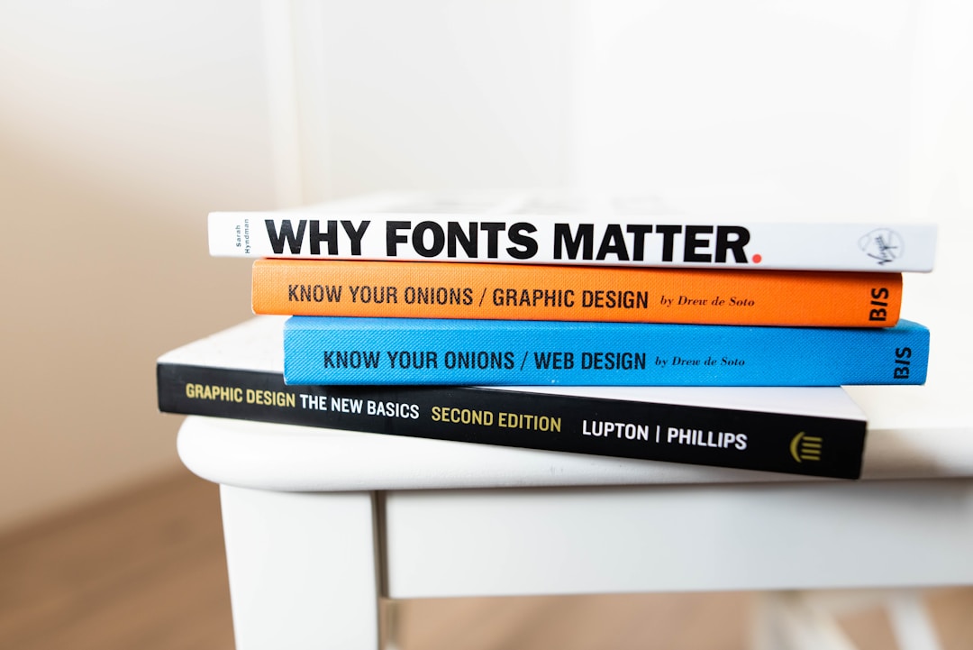
There’s a reason that modern business cards in a variety of unconventional sizes and styles—they’re meant to catch your attention. The same is true of your brochure design. You don’t want this project to become yet another pamphlet your target audience throws in their garbage bin.
From the quality and type of paper you print it on to the typography and icons adorning it, your brochure should stand out as something. Make it clear that you’ve gone through your design process in a creative way. Even within the constraints of your brand identity and project objectives, there are many different ways you could approach your brochure—do all you can to ensure you choose the best way.
A contemporary company thrives on quality graphic design, so much so that every brochure, flyer, and batch of postcards needs the same level of attention and creativity. With the right tools and a focused design process, you can make sure your trifold brochure, pamphlet, or other print design catches your target audience’s eye and makes them remember your brand. And, of course, it will successfully drive ideal customers to your brand!

